Hyundai Capital
Material Design Renewal
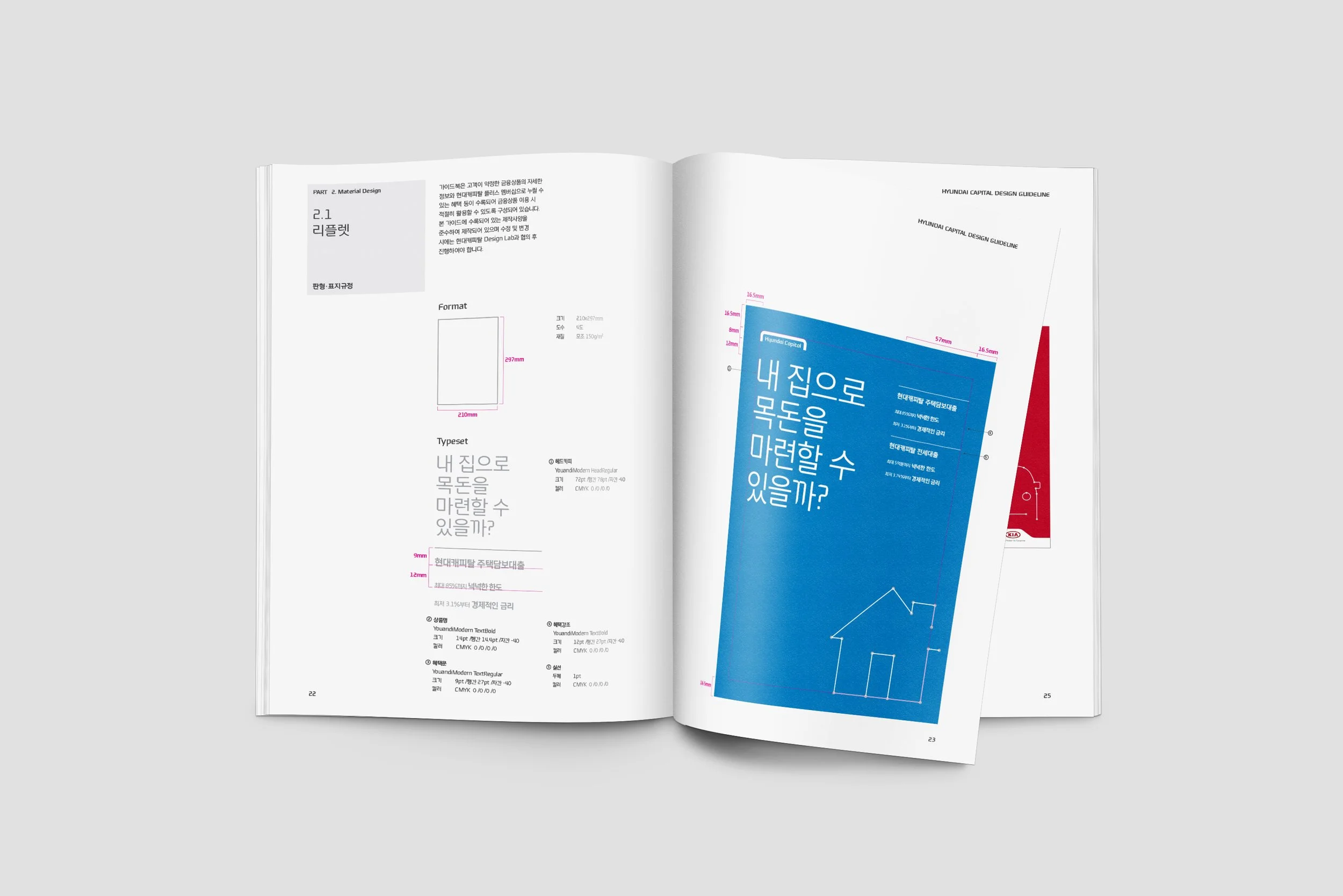
In the project to improve the design look and feel of Hyundai Capital's 'Communication Material,' which is utilized throughout the marketing process, including the recruitment, issuance, claim and use stages, a new design approach was adopted. The new design was centered around the brand idea of "Simple, Knowledgeable, Logical," incorporating iconic graphics, easy-to-read typography, and a more proactive use of signature colors. This direction resulted in a distinctive and visually different look and feel from Hyundai Card's existing materials that heavily relied on realistic imagery. A comprehensive guideline was established to outline the expression strategies and ensure consistency in the brand's visual representation across various materials.
SCOPEBrand Identity
Editorial Design
Technical Guidelines
Date2015. 1


